
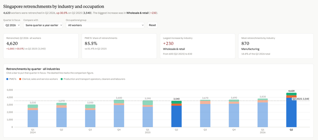
Anthropic just launched Claude Dashboard within the Artifacts section. I downloaded the Ministry of Manpower’s latest Q2 labour market data, filtered for retrenchments, limited the columns to the last few years, cleaned the file and then uploaded it to Claude. My prompt asked Claude to focus on which industries and jobs were being impacted the most. This is the resulting dashboard – it’s pretty phenomenal, and will eliminate many dashboard creator roles.
Simple tips for building effective dashboards with AI:
- FILTER the data to only what is essential. MOM’s data stretched back ten years, but I limited it to two years (2024 to 2026).
- CLEAN the data before uploading. The fastest way is to ask AI to clean the data within Excel and then save the data as a raw CSV file.
- PROMPT and articulate what your dashboard’s focus should be. If you don’t do that, your dashboard will be full of random charts.
- PRETTIFY it by uploading your favourite colour palettes. I did that earlier this morning with LTA data but it got tiring. So this retrenchment dashboard uses the standard Claude brown hues.
See the dashboard here.