
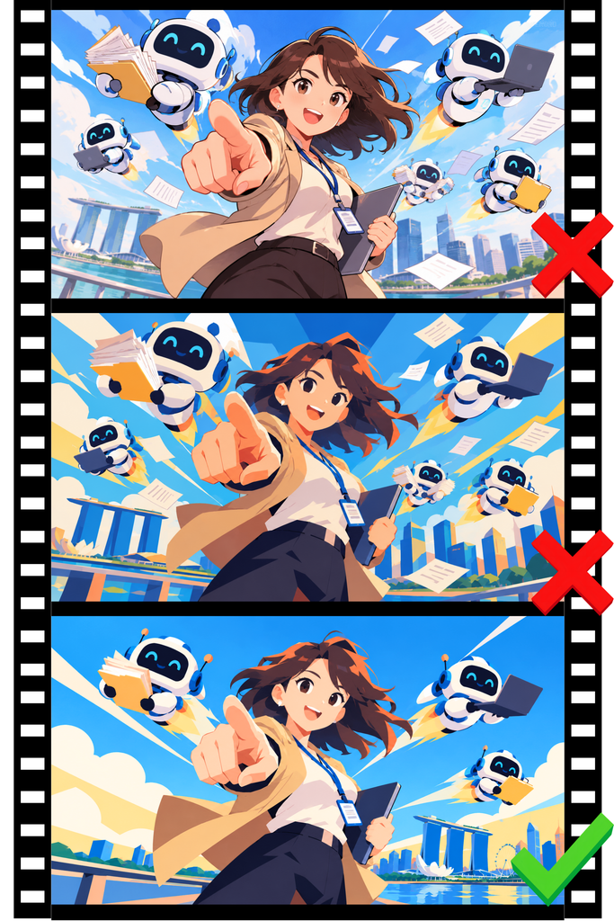
Here’s my process for generating AI visuals that don’t look AI-sloppy. Today I had to create a cover for the deck “AI for Work Productivity”, a two-day workshop for Nanyang Technological University Singapore alumni that’s happening this week.
- Visualise the image in my head (assuming I don’t have a reference image to upload).
- Prompt the first version.
“anime style, female office worker pointing forward, dynamic angle, many robots flying in the background carrying documents and laptops. vibrant colors, minimalistic details. 16:9 AR.”
- Iterate prompts to minimise clutter and excessive color usage.
“abstract design style, 256 color palette”
“reduce robots to 3”
“minimise face details”
- Keep iterating until happy.
Remember, in design, less is more.